1. Logo meaning:
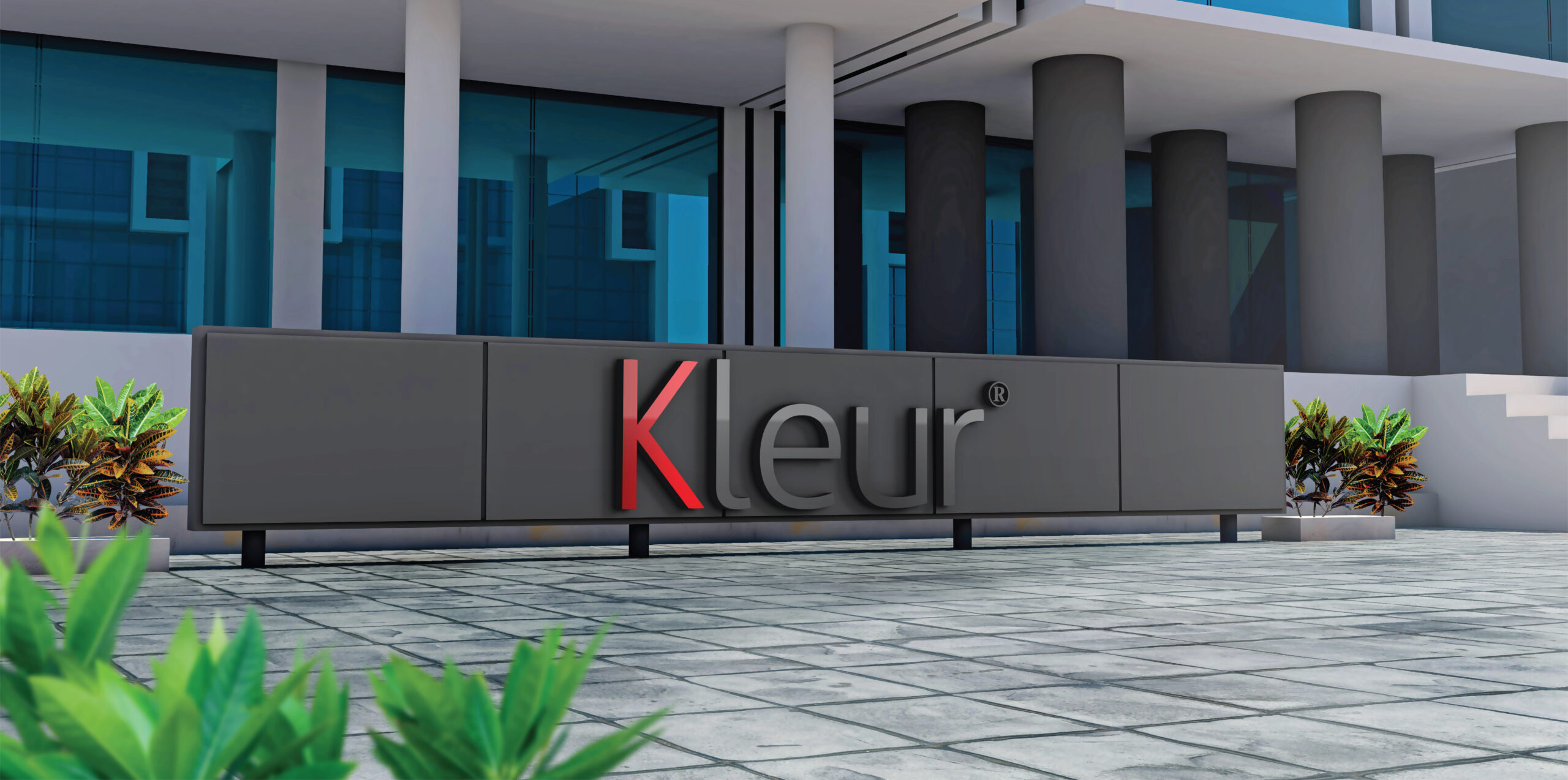
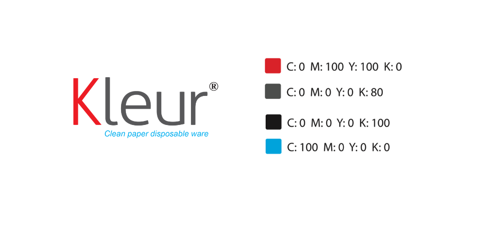
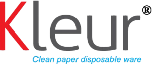
The Kleur logo is minimalist but not simple. Forget about symbols and icons, Kleur chooses a simple logo approach with only letters, focusing on the balance and wonderful charm of straight lines and curves in the characters. The simple, clear beauty in the logo shows seriousness, neatness, responsibility and heart.
Kleur in Dutch means “color”, just like life, people, and professions all have different color blocks. Starting with the letter K with a strong, attractive, enthusiastic, energetic and passionate red color. This is also the main color chosen by food and beverage businesses. The phrase behind goes down to gray tones, the color of trees and earth, of nature. Gray is more neutral and practical, softening the dazzling color of the letter K, giving the logo a balance, symmetry, and color harmony.
2. Color characteristics:
-Main color: The detailed color of the logo’s components helps to apply brand recognition in a synchronous manner. Red is the color of emotion, strength, power and determination. Red represents PEOPLE.
Gray symbolizes TREES – EARTH – NATURE.
The harmony between PEOPLE and NATURE always gives us the most sustainable development. People are always creative, searching, building to create breakthrough achievements, but must respect and harmonize with the natural environment because it is the place that “heals” everything for people.
Auxiliary color: In addition to red and gray, the blue color of the slogan is also a color that can be included in designs to create highlights, however, it cannot occupy a large area. Blue represents beauty, purity, strength and independence. It is also the color of the sky and the sea, representing vastness, vastness, nobility and peace. It is also the color of imagination and creativity.
3. Typical fonts:
Kleur chooses the fonts: Aller Light, Time New Roman, Arial – these are popular, simple and familiar fonts. The company wants to express authenticity but steadfastness, simplicity but quality in the way of working and products. Only TRUE VALUE lasts forever.
4. Layout and color:
The characteristic of paper packaging (paper cups, paper bowls) is that the printing on it is very beautiful, aesthetic, professional like a “magazine”. It is a fertile ground for artistic creation, conveying messages, advertising… in addition to the main function of containing food and drinks. Therefore, the founders want to make paper cups, paper bowls that are convenient, functional, and full of “color”. The fresh or warm colors of life can be vividly conveyed on paper packaging. “Color” is no longer for SEEING but also for LISTENING and THINKING.
“Color” always plays a very important role in our lives, even the smallest ones, it affects our emotions and moods in different ways. It is a very powerful tool for communication and action. It is one of the powerful elements of art.
“Color” in English is Colour, but we want to transcribe it into Dutch as Kleur ([kløːr]), both creating a difference in connecting the letters in the name, because Dutch has an unfamiliar way of reading and combining words. At the same time, it is “intentionally” making it difficult for customers to read the name again. The hesitation and doubt that customers have when reading the word Kleur will hold them back for an extra 1-2 seconds to pronounce it, and may naturally imprint the word Kleur in their mind at that moment.
